
A master brand rollup asks customers to give something up. The pitch winning concept gave them more, instead.
Re-brand: Hillrom
40 → 5 → 1
Agencies bidding, finalists presenting, one chosen
client
Hillrom
role
Creative concept lead (pitch)
Design director
Project design lead
deliverables
Master brand architecture
Brand film
Unified digital ecosystem
120-Day integrated campaign (paid/earned/owned)
employment
frog, a Capgemini Invent company
The concern beyond the brief
Rapid acquisitions had left Hillrom with fifteen established brands, a fragmented identity, and a market that still saw it as the hospital-bed manufacturer rather than a connected-care medical technology company. What they asked for in their brief was a campaign announcing the mergers and re-establishing the company as an industry leader.
What was in the brief wasn’t the challenge. A master brand rollup asks customers to give something up. Each acquired brand carried real equity and real relationships, and consolidation looks, from the outside, like subtraction — the company you’ve been buying from is disappearing into a bigger one. If Hillrom did this rollup badly, they’d lose accounts while announcing their ambition.
WINNING CONCEPT
Everywhere There Is Care, We Are There

I presented four concepts. The one Hillrom chose was the one that solved the subtraction problem.
“Everywhere There Is Care, We Are There” makes breadth the story. Under that idea, every acquisition stops being a brand being absorbed and becomes evidence for the claim — proof of reach rather than loss of identity. The rollup argues for itself.
It also does the bed-tech-to-med-tech work without making a claim the market could dispute. Announce that you’re a high-technology company and you invite the audience to decide whether they agree. Claim presence across every setting where care happens and the acquisitions are the verification. The repositioning rested on a fact rather than an assertion, which is why it held.
And it tied the company to the caregiving mission rather than to a product category — range and meaning in the same line.
IT READ WARM AND WORKED
The structural argument only worked because of what sat underneath it. Hillrom was founded in Batesville, Indiana in 1929 as a family business, and it still runs its primary manufacturing and administration there — the corporate headquarters moved to Chicago in 2015, but the company never left the town it started in. I built the concept on what that heritage actually means in practice: relationships, connection, showing up, integrity. Not a regional flourish, but a read on how this company behaves and what its customers had come to expect of it.
That mattered strategically. An acquisition roll-up told as corporate consolidation is a financial story, and financial stories make customers feel like inventory. Told by a company whose identity is caring about people and staying connected to them, the same roll-up reads as reach rather than absorption. The Midwestern character is what let the structural idea land warmly instead of coldly, and I carried it through the visual system and the campaign elements rather than leaving it in the strategy deck.
Concepts
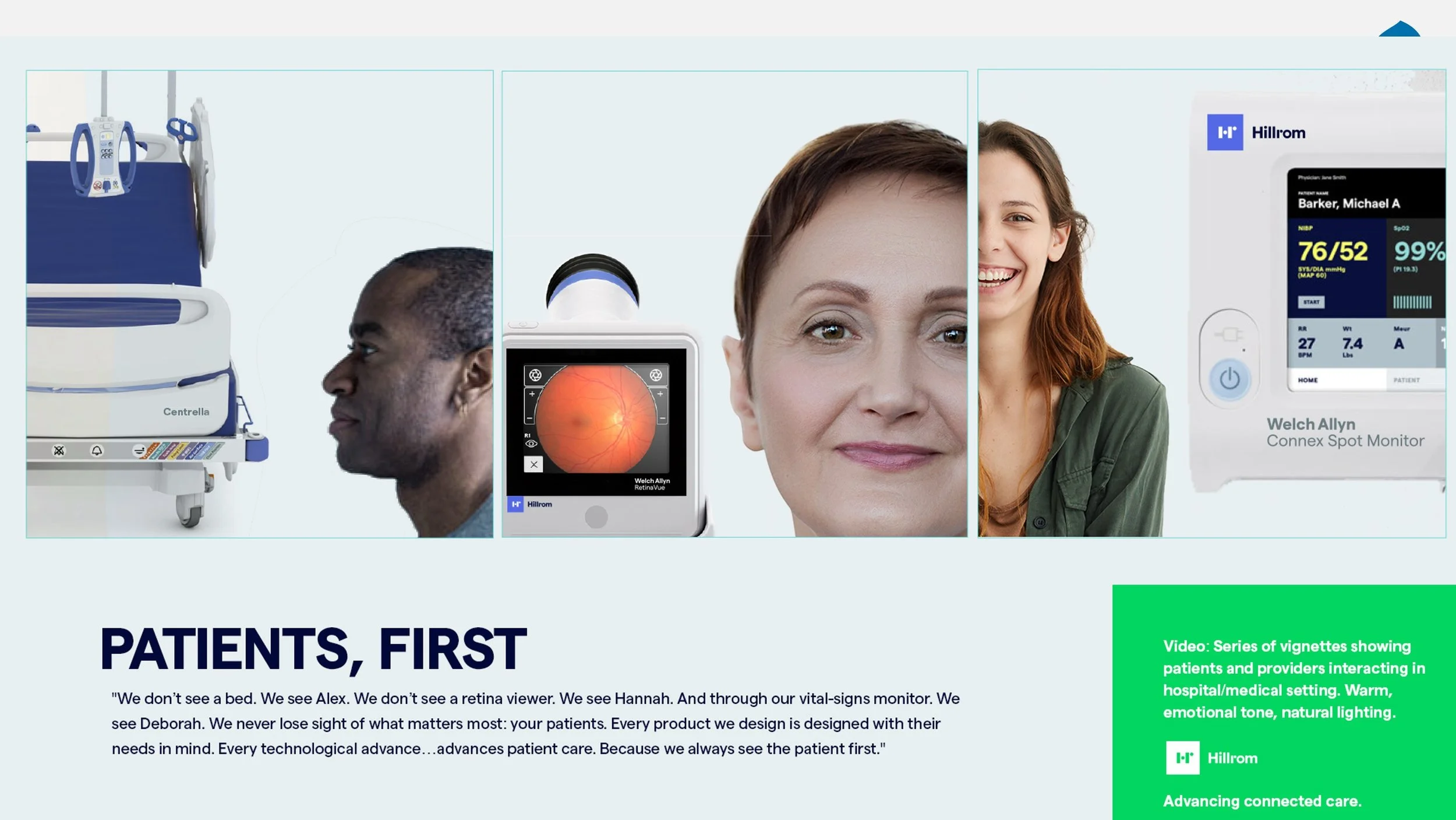
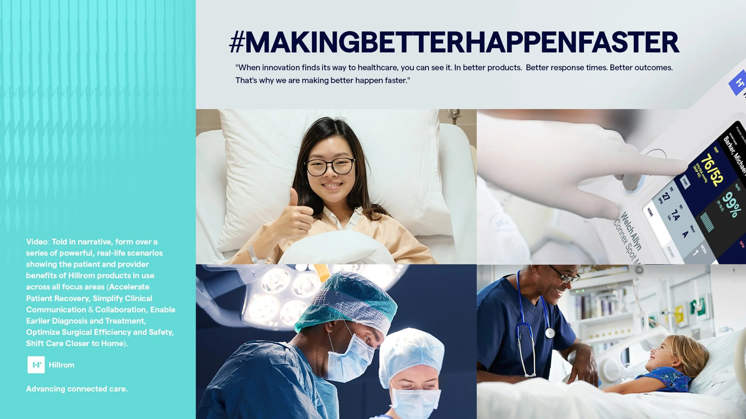
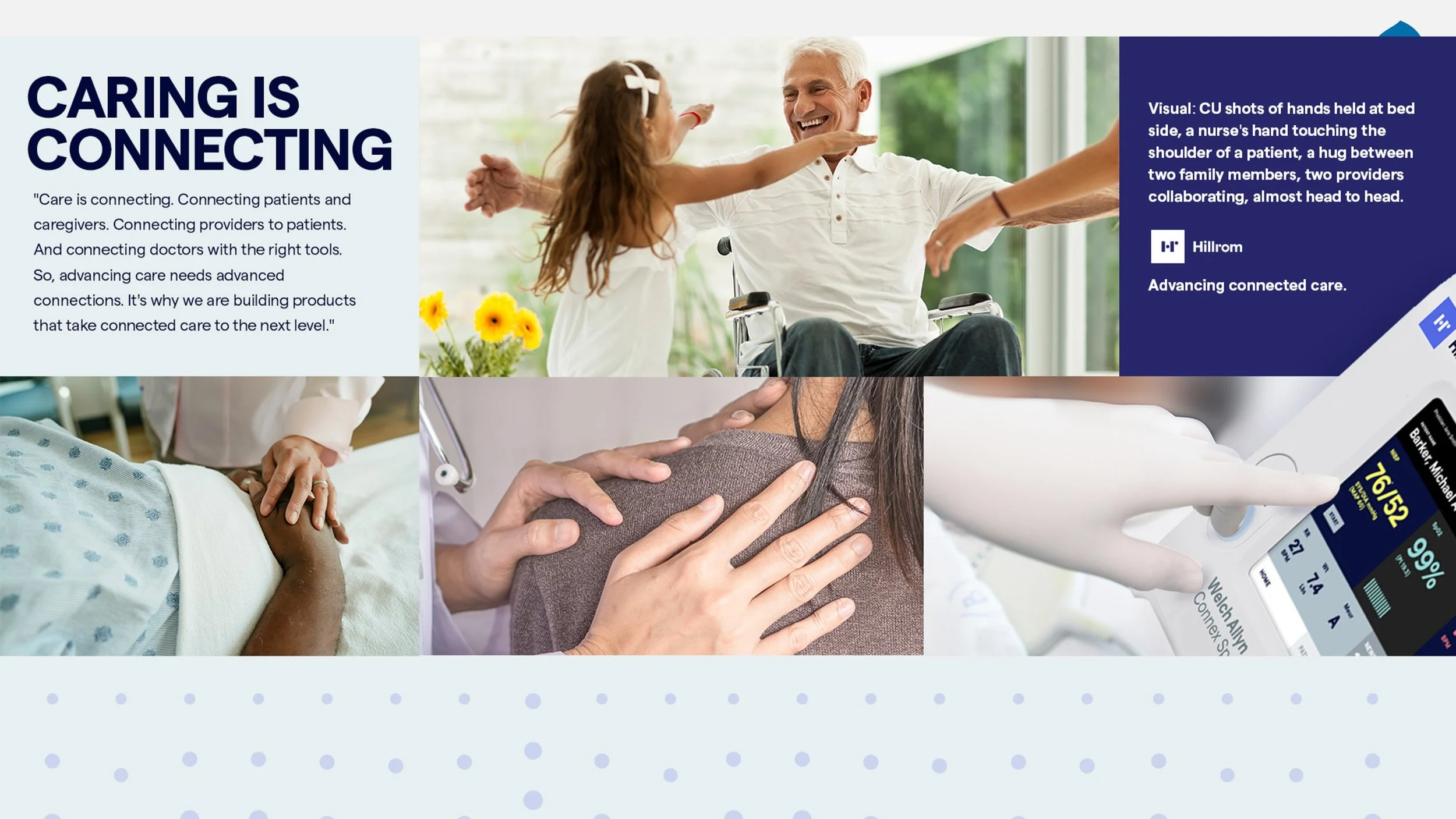
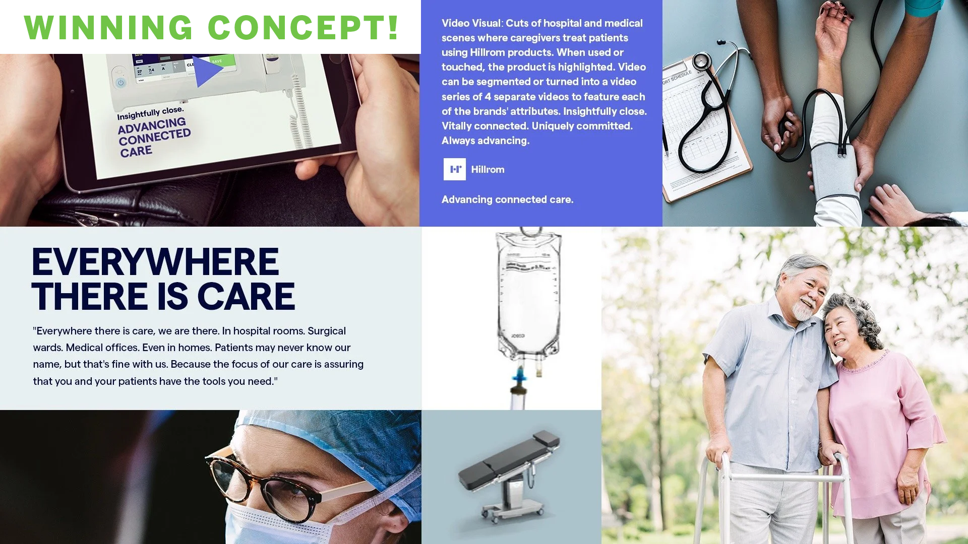
The campaign was built with people in mind, not the corporate message. We mapped which clinical specialties each acquisition brought with it, what those people currently believed about Hillrom, and where they could actually be reached — then built content against those answers.
Building the campaign specialty by specialty
REBRAND
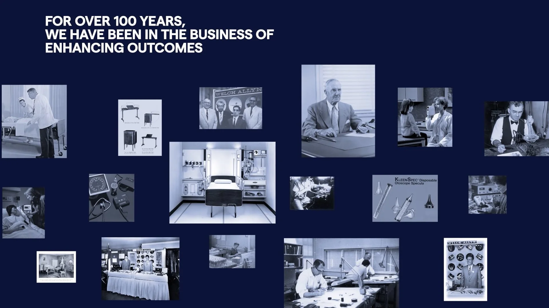
Brand video
SITE
Desktop and mobile
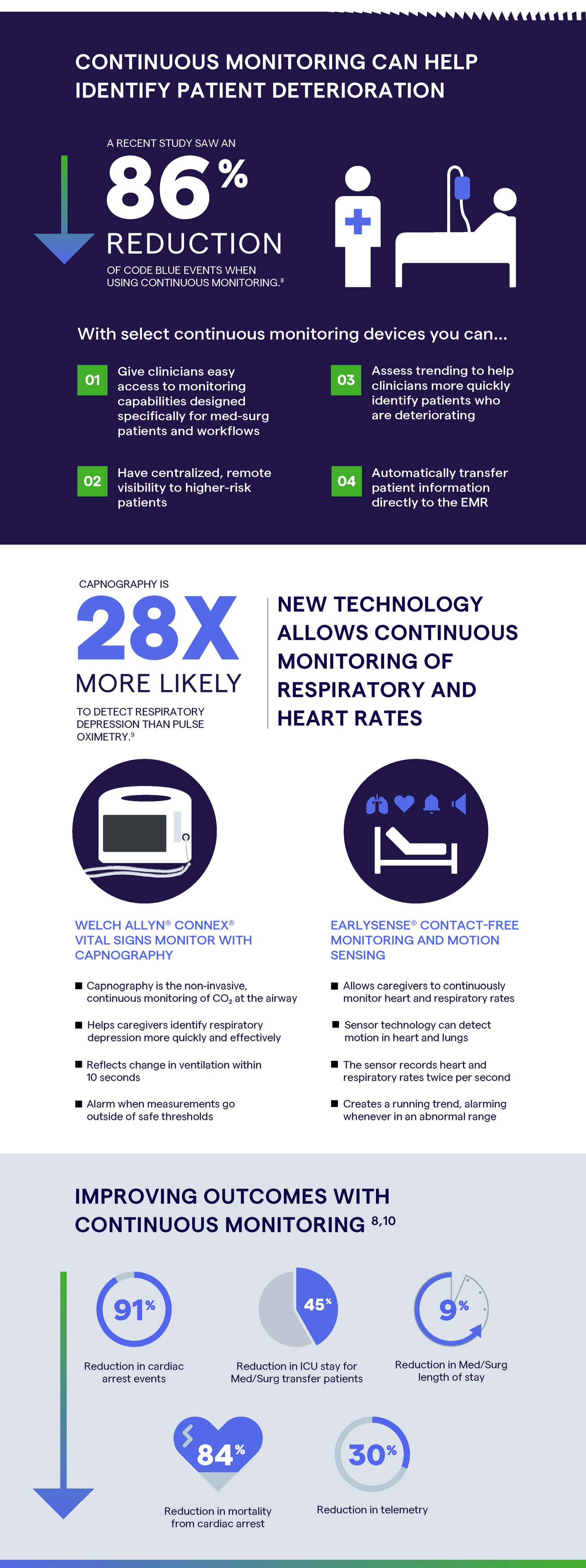
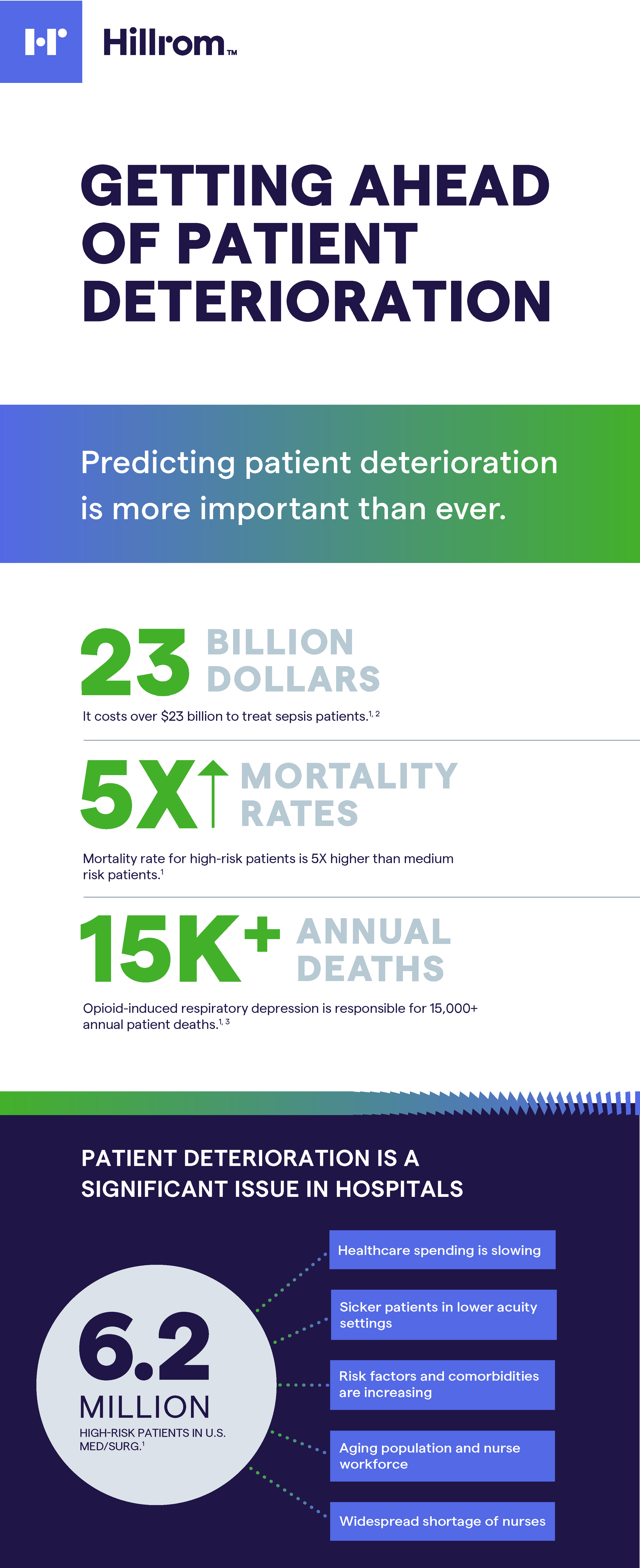
INFOGRAPHICS
The sepsis and patient-deterioration infographics exist because that mapping found an audience the content was genuinely useful to, not because the campaign needed another asset. It also extended the brand into specialty audiences.
DIGITAL ADVERTISING
Paid and unpaid placements across the 120-day campaign


NOTES ON THE WIN
A company mid-transition is watched closely by its own people and by the customers of the brands it has absorbed, and a fast, confident rollout told both audiences the new identity was decided and real. In brand transitions, hesitation reads as doubt.
The 120-day integrated campaign followed across paid, earned and owned channels, with a unified website, product architecture and customer stories completing the ecosystem.
When I presented the concepts, I’d spent enough time learning about Hillrom to be convinced it could have an incredible connection with its new customers.
Most creative pitches bring ideas and leave delivery to someone else. I brought four concepts and the plan to execute them in Hillrom’s timeline. Three weeks after the win, we were in production on the brand film. That pace was strategic, not logistical.
Outcome
15 → 1
Brands unified
3 weeks
pitch to film production
Fifteen acquired brands unified under one Hillrom master brand, with the market repositioned from bed-tech to connected-care med-tech under “Everywhere There Is Care, We Are There.”
Hillrom was acquired by Baxter and the brand retired within a three years of this rollout.