
Technical communications: Walgreens
Translating Project P, a complex technical system, so executives and boards could decide on it
client
Walgreens
role
Concept creator
Art director
Graphic designer
deliverables
Pitch explainer video
Data visualizations
Pitch deck
employment
frog, a Capgemini Invent company
Background
Our team worked with Walgreens’ CTO on Project P, a new AI-assisted technology.
Project P was a complex data-and-recommendations system: patient records, pharmacy visits, consent preferences, and third-party clinical research feeding a personalized recommendation engine that learned continuously from its own output.
The CTO, the Capgemini engineers, and the business consultants all understood it — we worked with it every day. But we needed the CEO’s approval to explore the idea further, and if the exploration went well, we’d need a comprehensive case to sell it to Walgreens’ non-technical decision makers.
Constraint
A proposal and an executive pitch have the same constraint: a technical argument, a reader with no time and no engineering background, and a decision made on whatever they can grasp quickly. In this case it was internal — the CEO.
The constraint decides the work. The question isn’t how much of the system you can explain. It’s how little you need to.
First: the CEO green light
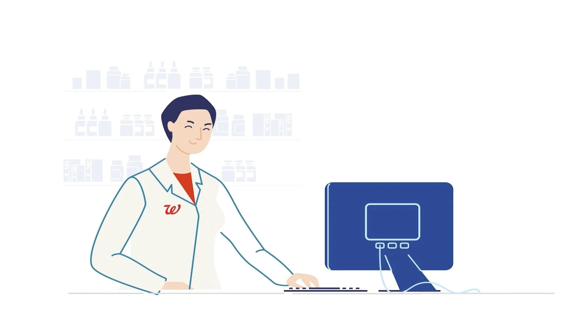
CEOs have limited time, and they want the shape of a technical idea rather than its mechanics. So I made a short, high-level explainer video — enough to understand what Project P was and why it mattered, and nothing beyond that.
The restraint was the craft. Everything I left out was something the engineers could have defended and the CEO didn’t need.
Then: the full case
With the green light, the CTO and our team of engineers, strategists, and business consultants developed the why, what, when, and how of the project. My job was to translate that to people outside of the project.
I built the deck as a narrative arc, opening with the question an executive actually asks first: why do we need this technology, and why now?
From there, data visualizations carried the What and the How — the big idea, the requirements, and the workflows, in a form a non-technical decision maker could follow.
Data visualizations
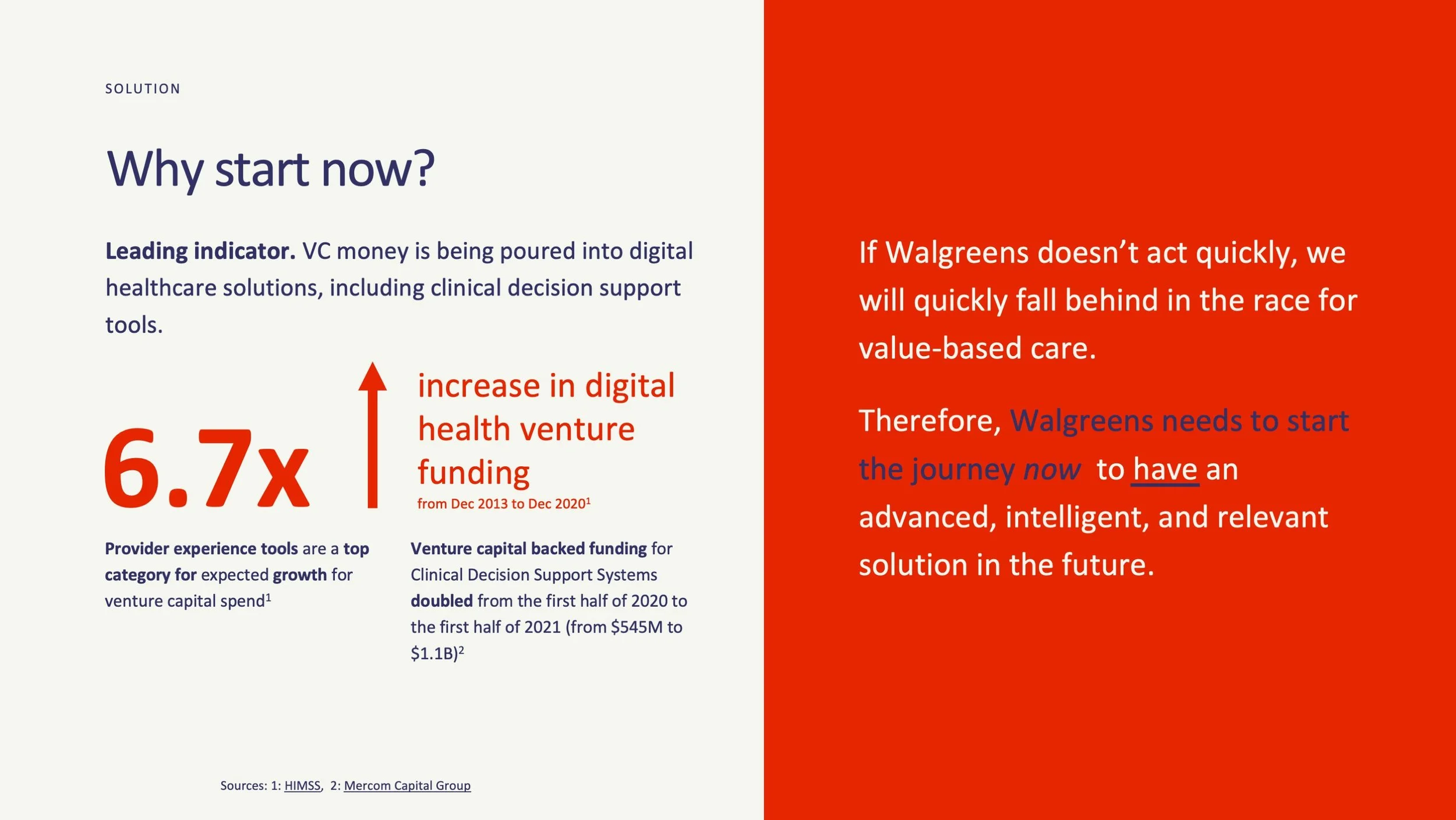
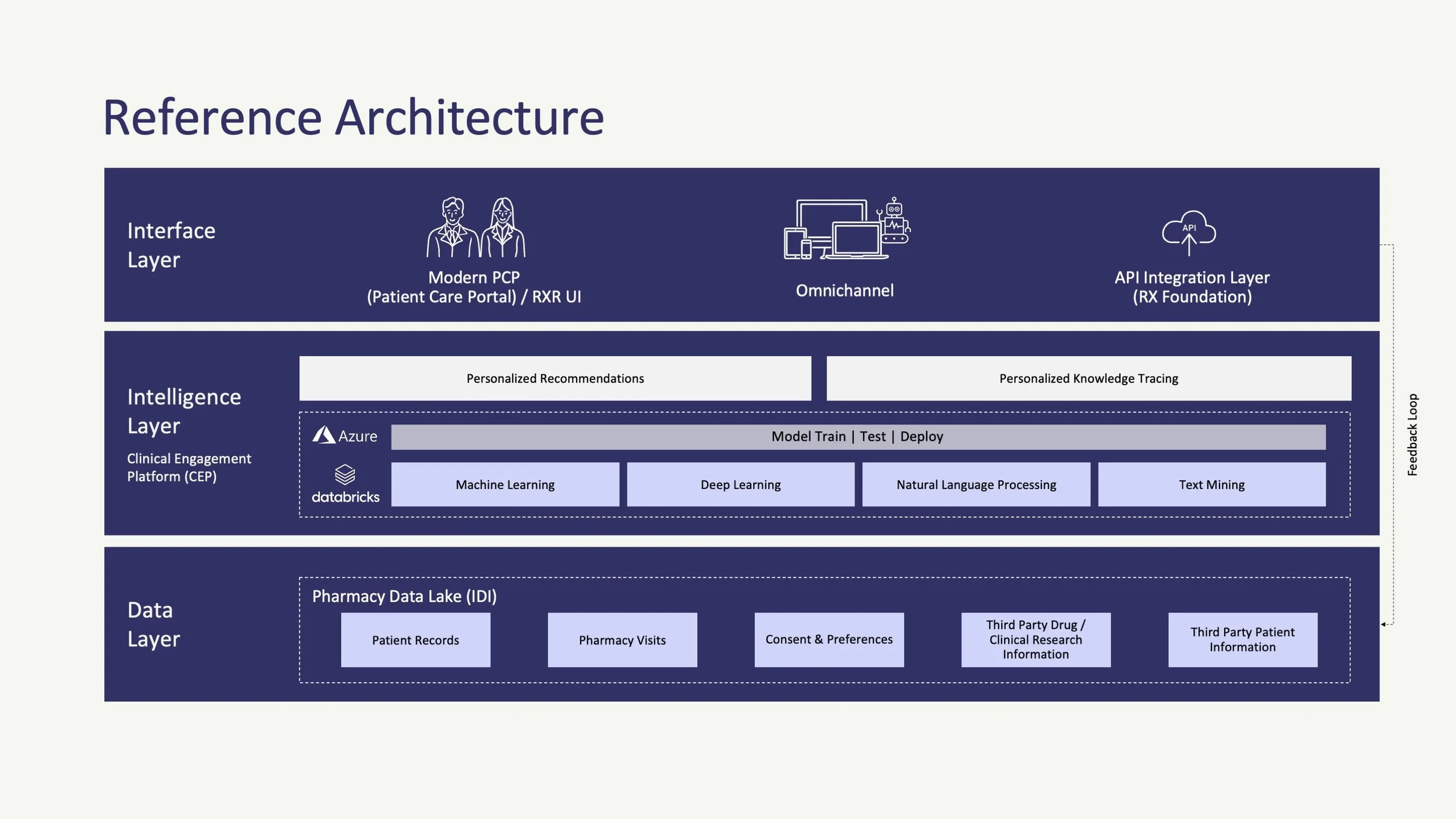
Each visualization was made for a different job. The Why Now is persuasion, built on one number. The reference architecture doesn’t simplify at all — it’s there so the people who would go looking for the rigor can find it. Deciding which slides argue and which slides prove is a different question for every audience.
“The Why Now” graphic
The urgency argument is made with market money rather than internal conviction, and the conclusion is stated outright on the right instead of left for the executive to infer.
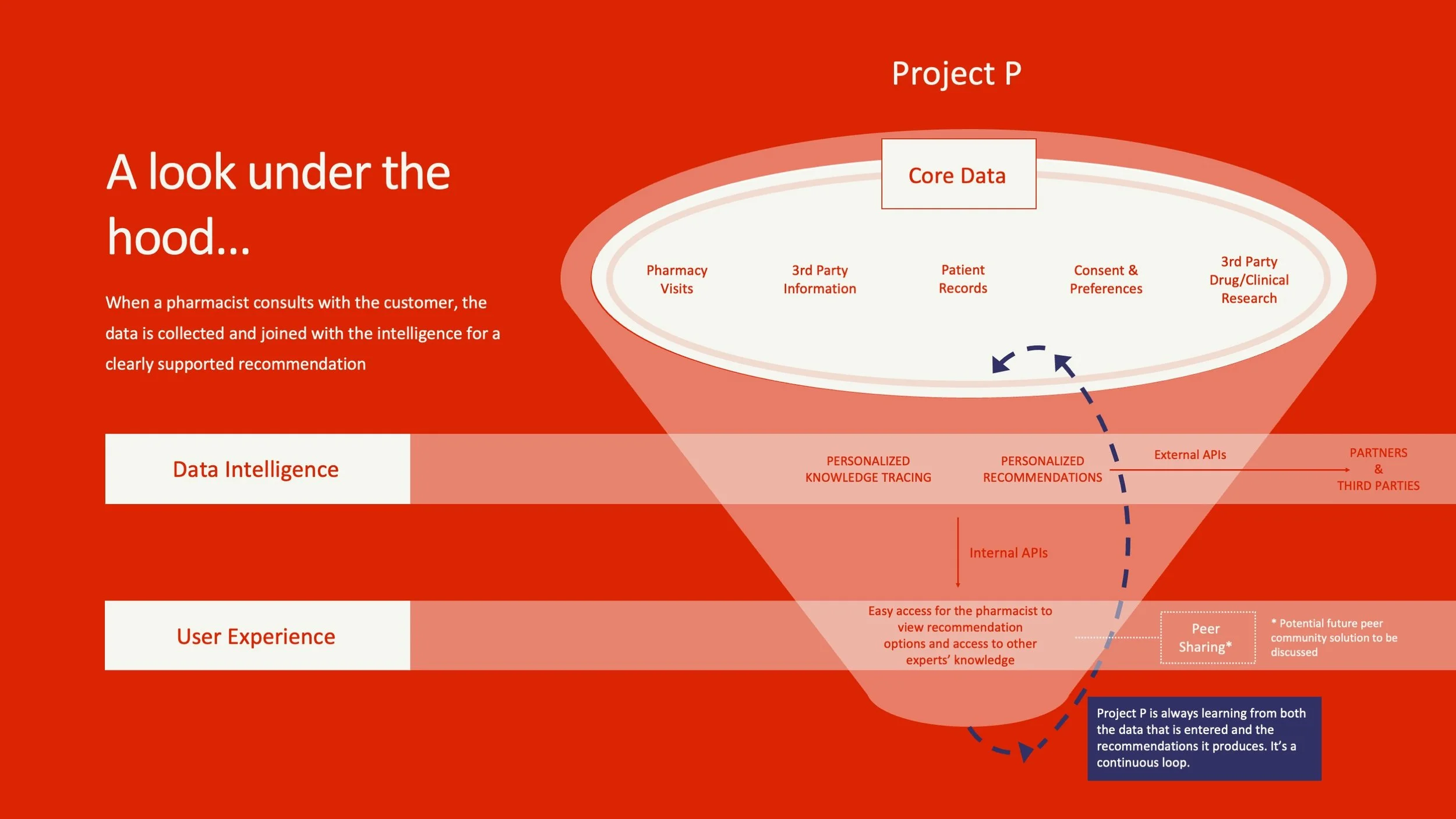
“The What” — product explanation
The system’s defining property is that it learns from its own output, so the loop is drawn rather than described — a dashed line returning to the data it started from.
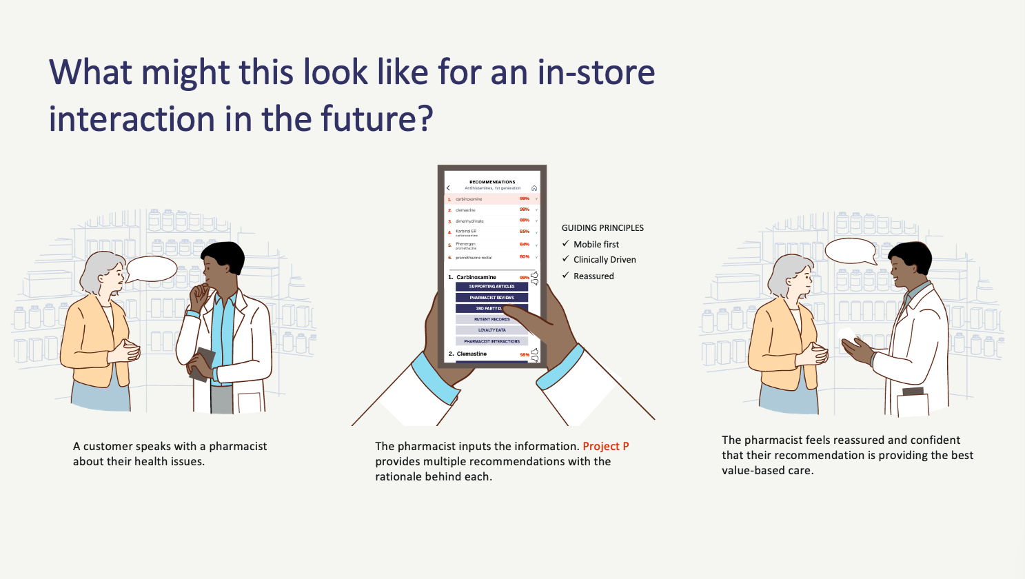
“The What” — product in use
Three panels moving from question to recommendation to confidence, with the payoff framed as what the pharmacist feels rather than what the system computes.
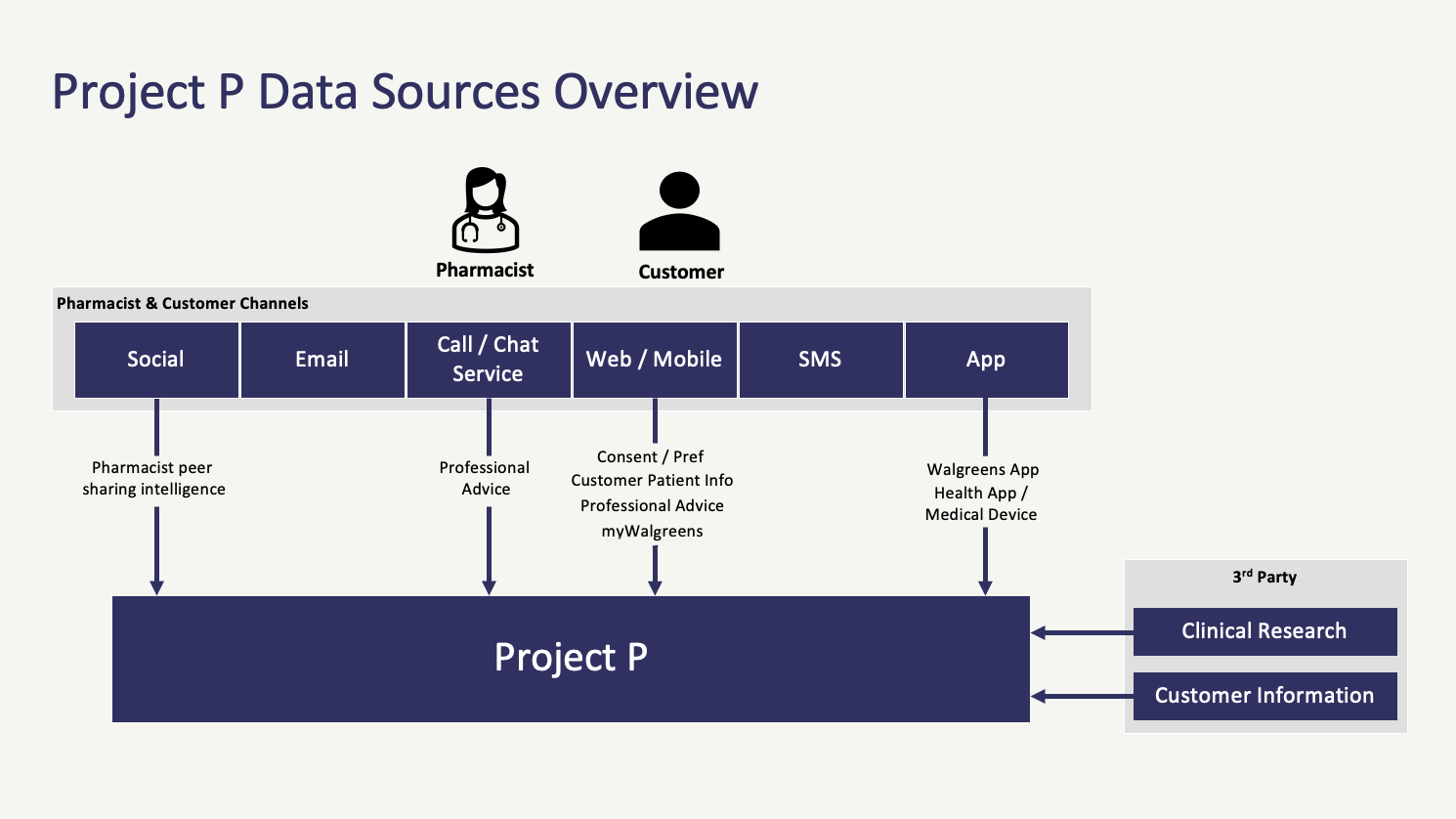
“The How” — data sources
Every arrow points one way into a single box, so “where does it know this from” is answered by the direction of travel before anyone reads a label.
“The How” — reference architecture
Stacked so the shape reads even if the labels don’t — what people touch, what thinks, what stores — with the engineering detail left intact for the reviewers who would go looking for it.
Outcome
The CEO understood Project P from the video and greenlit further exploration — a decision made by the highest authority in the company, on the strength of one deliverable.
The full presentation then carried the idea to Walgreens’ non-technical decision makers. The technology was still under consideration when our engagement ended.
1 video
from complex AI system to a Fortune 20 CEO’s green light